
The difference between simply printing an old map and creating a fine art reproduction worth displaying.
At first glance, two reproductions of the same historic map may appear almost identical. They show the same coastlines, towns, rivers and decorative cartouches. Both may be advertised as reproductions of an original centuries-old engraving, and both may look perfectly acceptable in a small photograph on a website.
Yet place them side by side, and the differences can be considerable. One may have crisp lettering, carefully balanced colours and the subtle warmth of aged paper. The other may look flat, excessively dark or strangely bright, with fine engraving lines disappearing into the background.
The difference is not necessarily the map itself. It is what has happened to the image between the surviving original and the finished reproduction. At The Old Map Company, we believe that a historic map deserves considerably more care than simply downloading an image and pressing Print.
A centuries-old map is not a ready-made printing file
The original maps produced by cartographers such as John Speed, Joan Blaeu and Gerard Mercator were extraordinary achievements. Their engraved lines, fine lettering, ornamental borders and elaborate decoration were intended to be examined closely.
But surviving originals have histories of their own. Over several centuries, a map may have been folded, bound into an atlas, exposed to light, handled by generations of owners or stored in less-than-ideal conditions. Its paper may have darkened, its colours changed and its surface acquired stains, foxing or other marks.
When a historic map is photographed or scanned, all these characteristics may appear in the digital image. So can imperfections introduced by the photographic or scanning process. Poor illumination can create uneven tones. A camera that is not perfectly aligned may introduce distortion. An unsuitable digital file can lose delicate engraved detail long before the image reaches a printer.
A high-resolution image is an essential starting point — but it is not, by itself, a guarantee of a good reproduction.
The work that takes place before printing
Preparing a historic map for reproduction requires a balance between improvement and authenticity. The objective should not be to make a centuries-old engraving look as though it were produced yesterday. Much of its appeal comes from the character of the original.
Nevertheless, there is often considerable scope to improve the reproduction without compromising that character. Depending on the condition and quality of the source, digital preparation may involve correcting uneven illumination, adjusting tonal balance, reducing distracting marks and improving the separation between engraved lines and their background.
The most important consideration is knowing when to stop. Excessive sharpening can create unnatural outlines around fine lettering. Heavy contrast adjustments can fill delicate hatching with solid black. Aggressive cleaning may remove the appearance of the paper entirely. Careless digital restoration can even alter or obscure historically important details.
A good reproduction should reveal the cartographer’s work, not replace it with the modern editor’s interpretation.
Before and after: the whole map
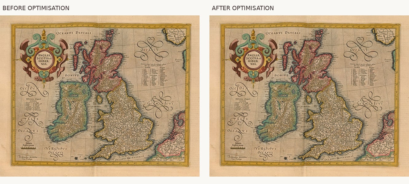
The example below shows two preparations of Gerard Mercator’s Anglia, Scotia et Hibernia. The differences in background tone and engraved definition may be subtle at first glance, but they become much clearer in a close-up.
The smallest details often matter most
Old maps reward close examination. A county map by John Speed may contain miniature town plans, coats of arms, decorative figures and hundreds of place names. A Blaeu map may reveal beautifully engraved lettering, delicately drawn hills and intricate ornamental work. These are not incidental decorations: they are part of the map’s historical and artistic interest.
Unfortunately, they are often the first things to suffer when an image has insufficient resolution or has been enlarged beyond its useful limits. A map might look impressive from across a room yet disappoint when someone approaches to examine the names of familiar villages and market towns. For many collectors, that close examination is precisely why the map was purchased.
It is therefore important to evaluate a source image at the intended printing size, rather than judging it solely by how attractive it appears on a computer screen. Simply increasing the number of pixels does not necessarily restore missing engraved detail. Where a better-quality source is available, using it is preferable to trying to manufacture detail through software.
Before and after: the engraved detail
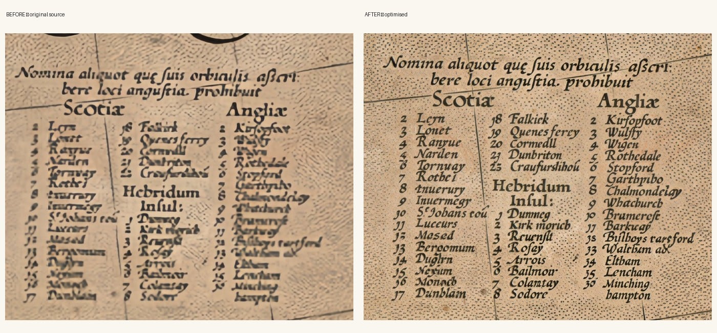
Look at the flourished North Sea lettering, the coast of Scotland and the columns of small place names. This is where careful preparation earns its place: it should help the viewer appreciate the engraver’s craftsmanship without inventing detail that was never present.
Colour should enhance the map, not overwhelm it
Historic maps are frequently associated with beautiful hand colouring, delicate greens, muted yellows, soft pinks and warm shades of brown. But there is no single colour treatment suitable for every map. Some maps were issued uncoloured; others were coloured by hand, either when first published or considerably later.
An excessively saturated reproduction may look striking on a screen but lose the restraint of the original. An excessively faded reproduction can make a beautifully engraved map appear lifeless. Even an uncoloured map requires thoughtful tonal preparation. Its background, engraved lines and subtle variations in tone all contribute to its appearance.
A monitor produces light; paper reflects it. This is why suitable colour management, printer profiles and examination of actual prints matter.
Why the printing process matters
Once a map has been properly prepared, the next consideration is how it will be printed. There is a substantial difference between an ordinary decorative poster and a professionally produced fine art print.
At The Old Map Company, we use museum-quality giclée printing with archival pigment inks on textured fine art paper. Giclée is a term commonly used for high-quality inkjet printing, but the word alone is no universal guarantee of quality. The materials, image preparation and printer settings all matter.
Pigment inks are particularly valuable for fine art reproduction because they can offer excellent colour stability and lightfastness when combined with suitable paper and appropriate display conditions. They also allow subtle tonal gradations to be rendered with precision. The challenge is not simply to produce rich colours: it is to retain the character of fine engraving, from the darkest lettering to the faintest linework.
Why fine art paper makes such a difference
Paper is far more than a surface on which an image is printed. Its colour, texture, thickness and coating influence the finished result. A lightweight glossy paper may suit a photograph or an inexpensive poster, but it can be less sympathetic to a centuries-old engraving.
Textured fine art paper offers a different experience. Its surface lends a gentle tactile quality, while a carefully chosen matt finish avoids distracting reflections. The paper complements the appearance of the old map without pretending that the reproduction itself is antique.
We supply our maps unframed, allowing customers to choose the frame and mount appropriate to their home, collection or interior scheme.
A reproduction should be honest about its origins
An original antique map and a modern reproduction are entirely different things. An original may be rare and historically significant because of its age, condition, printing history or provenance. A reproduction offers something else: the opportunity to enjoy the artistry and geographical interest of a historic map without the expense or conservation responsibilities of owning an original.
A fine art reproduction should not attempt to mislead anyone about its age. Its value lies in the quality and faithfulness of the reproduction, the materials used and the pleasure it gives its owner. Old spellings, unusual boundaries, decorative figures and even geographical mistakes can be integral to understanding an early map. They should not be silently corrected to meet modern expectations.
The task is to reproduce history clearly, not rewrite it.
The finished print deserves a final inspection
A reproduction may look excellent on screen yet reveal an unexpected problem in print. Slight differences in colour, excessive darkness or insufficient definition can become apparent only on paper. Examination of the physical print is therefore an important final stage.
Are the engraved lines clear? Does the background look natural? Are the colours suitably balanced? Has the original’s character survived the transition from digital image to fine art paper? These questions matter more than headline claims about printer specifications.
At our Cornwall workshop, we follow a simple principle: “We will never supply a finished map that we wouldn’t be happy to hang in our own home.”
So, are all old map reproductions the same?
Certainly not. Two suppliers may start with an image of the same historic map, yet produce very different results. The quality of the source image, the skill of its preparation, the preservation of fine engraving, the accuracy of colour reproduction and the choice of printing materials all influence the finished piece.
A reproduction need not be expensive to be beautifully produced. Equally, a high price is no guarantee of exceptional quality. For someone choosing an old map to display, give as a gift or add to a collection, it is worth looking beyond the subject and date of the map to consider how it has been reproduced.
A well-prepared fine art print lets us appreciate the original cartographer’s and engraver’s work once again, sometimes centuries after the map first appeared. That is what a good old map reproduction should achieve: not simply a picture of the past, but a lasting opportunity to enjoy its craftsmanship.
The Old Map Company has been selling reproduction maps online since 1999. Our maps are printed in Cornwall using archival pigment inks on textured fine art paper and supplied unframed.