From Exploration to Elegance
By the 1770s, the Pacific Ocean had moved from myth and speculation into the realm of serious navigation. Voyages by French, British, Spanish, and Dutch explorers—most famously Cook and Bougainville—had added real shape to coastlines and island groups. Bellin’s role was not that of the adventurer, but of the master editor: gathering reports, comparing sources, and turning scattered observations into a coherent whole.
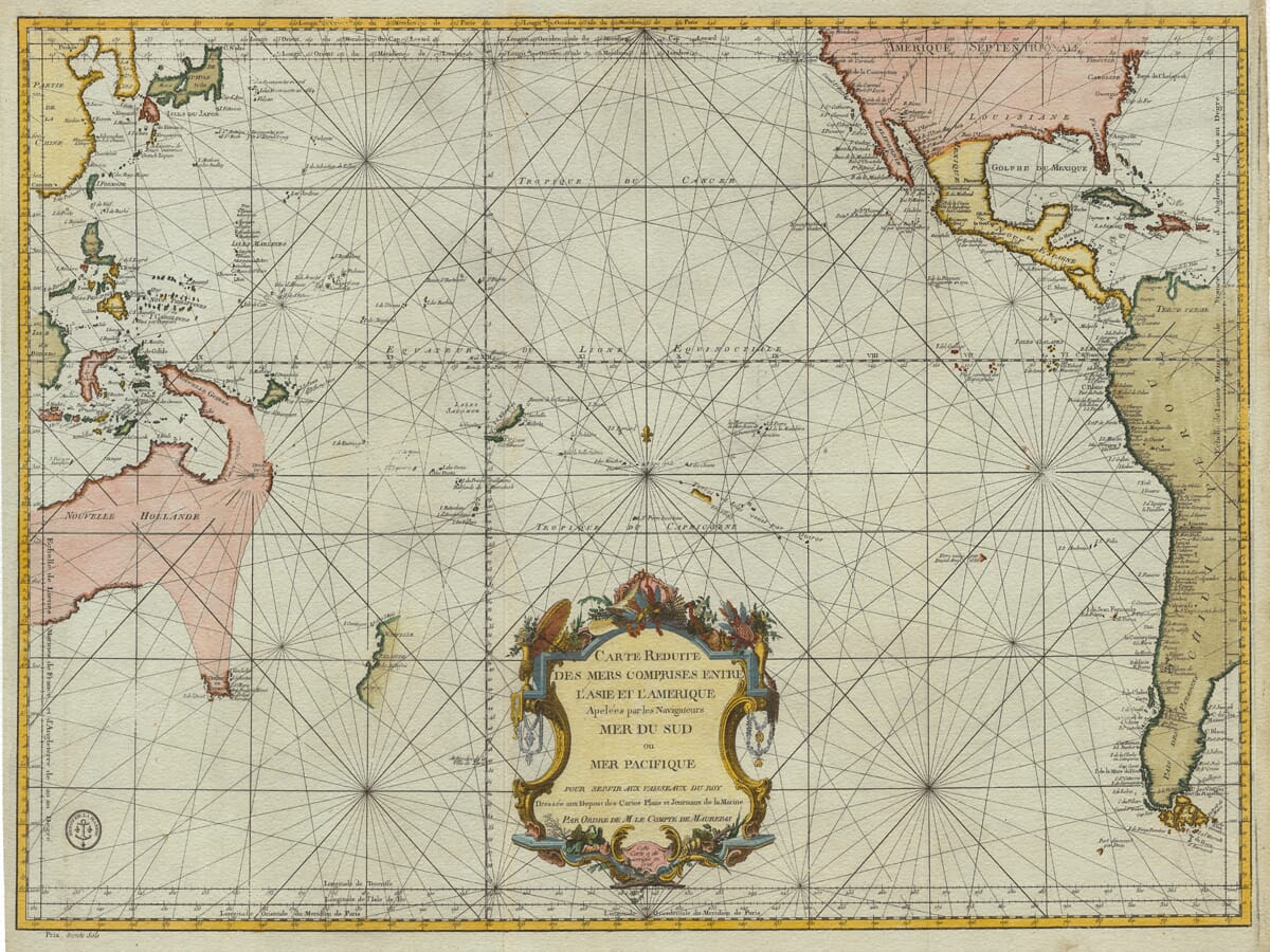
The result is a reduced sea chart, intended for plotting long ocean passages rather than hugging coastlines. It helped navigators understand routes, distances, and bearings across enormous stretches of open water—while also presenting the Pacific as a single, unified space.
A Design Made for Navigators—and Modern Interiors
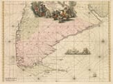
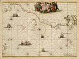
One of the immediate visual pleasures of this old sea chart is its web of rhumb lines, radiating from compass roses like a geometric starburst. Originally practical, these lines now give the chart a strong graphic rhythm that works beautifully on a wall.
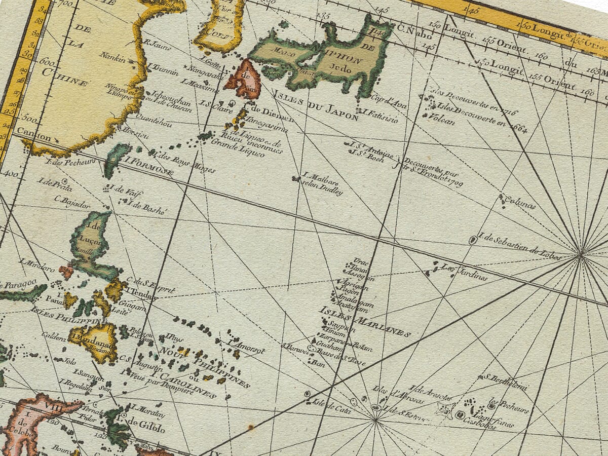
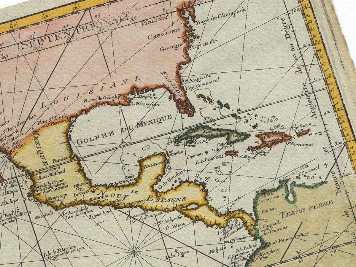
The coastlines strike a careful balance between confidence and uncertainty. The Americas appear solid and assured, while parts of Australasia, New Zealand, and the North Pacific feel tentative—reminding us that this was still a work in progress. Islands emerge almost like stepping stones across the ocean, lending the chart a sense of movement and discovery that feels surprisingly modern.
The Meaningful Gaps
Just as important as what the chart shows is what it leaves out. Indigenous place names and navigation networks are largely absent, even though Pacific Island cultures had mastered these waters long before Europeans arrived. These silences tell us a lot about the mindset of the age: maps like this presented the world as Europe understood it, smoothing over existing knowledge in favor of imperial clarity.
Seen today, those gaps add another layer of interest. They invite reflection—and spark conversation—making the chart more than just decoration.
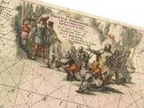
Decorative Details That Elevate the Whole
The ornate cartouche anchors the composition with classic French flair. Its flowing lines, elegant lettering, and subtle symbolism frame the chart as an official, authoritative document, while also giving it the visual richness people look for in antique map wall art. It’s the kind of detail that rewards closer inspection, whether hung in a study, living room, or office.
Why This Old Sea Chart Works So Well as Wall Art Today
A modern, high-quality reproduction preserves the crisp engraving, balanced tones, and generous scale that made the original so impressive. Hung on the wall, the chart feels immersive—inviting viewers to trace routes, follow coastlines, and imagine the world as it appeared in 1776.
It’s this blend of history, artistry, and sheer visual impact that makes Bellin’s Pacific chart such a compelling piece. As an old sea chart, it connects us to the age of sail; as wall art, it brings depth, elegance, and a sense of adventure to a modern space.
In Short
Bellin’s 1776 Pacific sea chart is more than a historical document. It’s a beautifully composed image of exploration, ambition, and curiosity—one that still resonates today as a stunning and meaningful piece of wall art.